Badu
Client
Badu
My role
UI/UX Audit UI design
Industries
Saas
Badu is an advanced CRM platform designed to streamline client management and elevate customer support interactions for businesses. Faced with the task of overhauling the existing Admin platform, I delved deep into the client's requirements through comprehensive interviews and various iterations. By gaining a clear understanding of their needs, I executed a strategic redesign that gave the platform a facelift and also improved the user experience.

THE PROBLEM
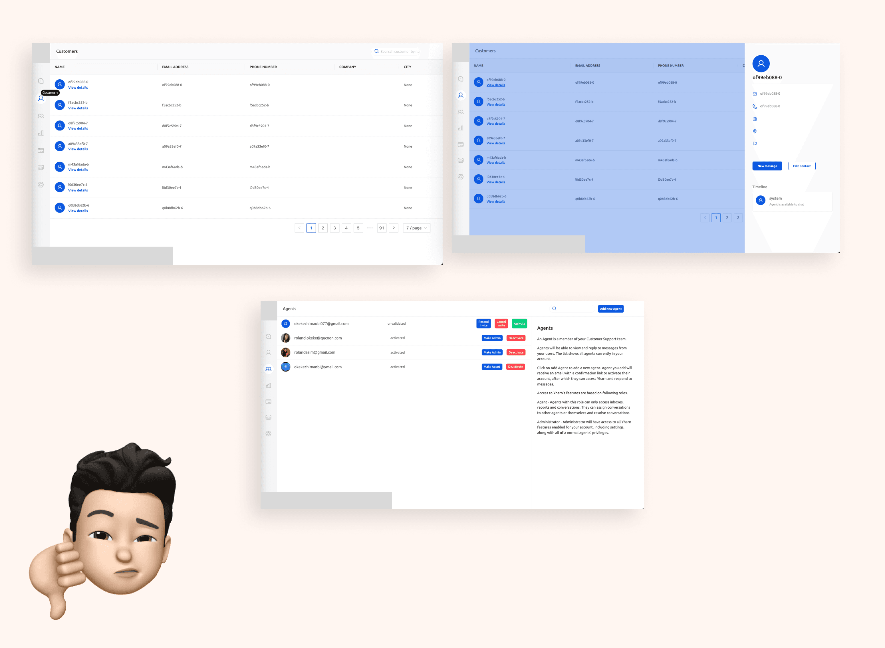
Analyzing the current platform revealed significant issues with intuitiveness and unclear user flows, directly impacting the overall user experience. Additionally, the lack of clear administrative control over operations raised concerns. This prompts the critical question: How might we enhance the functionality and control for administrators within the interface to improve overall user experience while also refining the user interface?
PROCESS
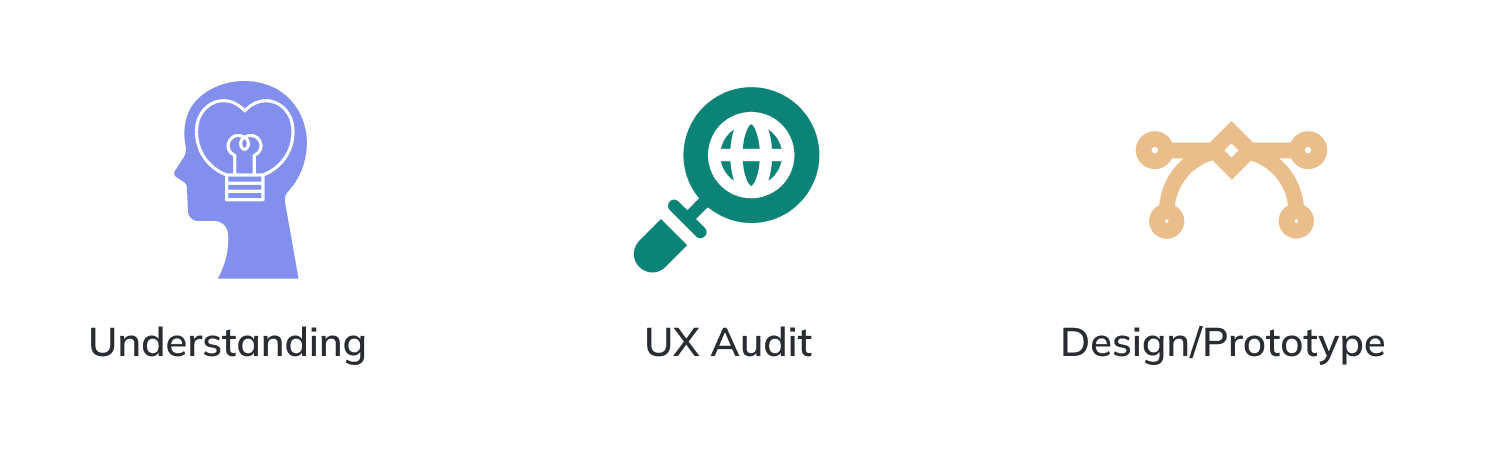
Understanding: At the outset, gaining a deep comprehension of the project's objectives or challenges was my primary focus, laying the foundation for progress.
UX Audit: With clarity on the project's scope, I delved into an extensive evaluation of the current platform, drawing insights from competitor analysis and user behavior studies.
Design/Prototype: Drawing from initial research, I transformed ideas into concrete designs, iterating on wireframes and incorporating feedback. Crafted prototypes to align stakeholders, facilitating collaboration and clarity throughout the design process.
RESULT AND INSIGHT
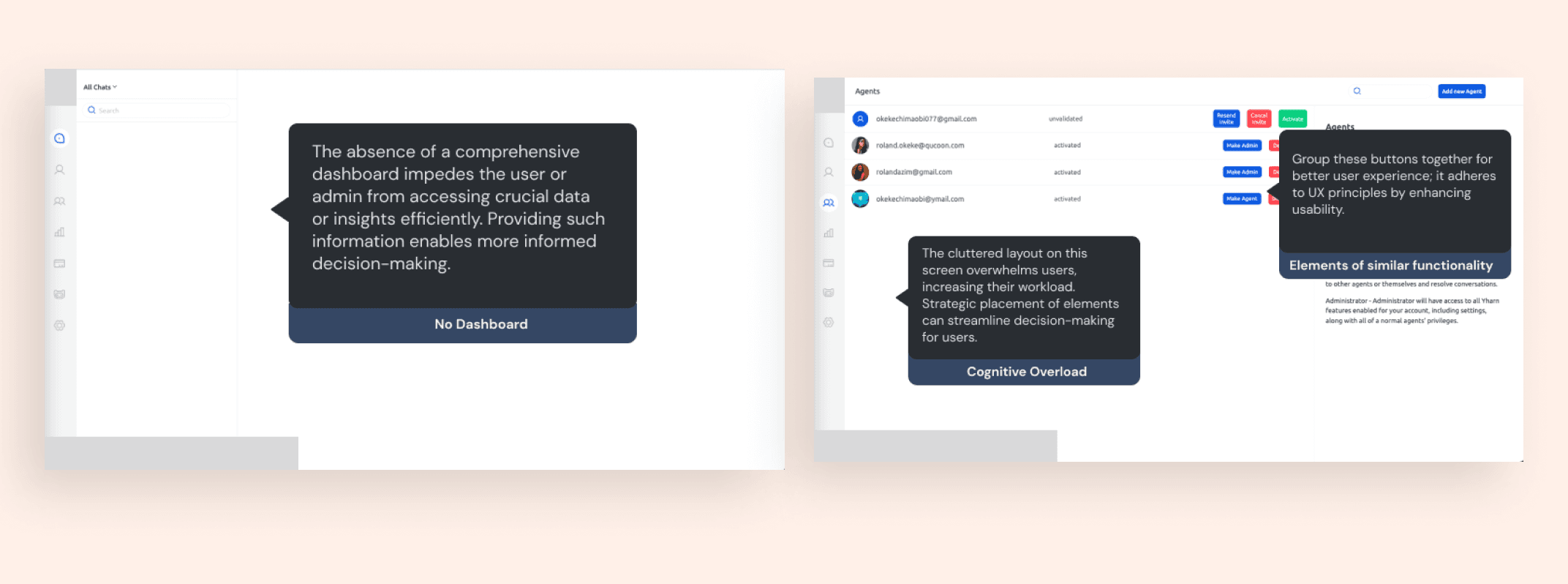
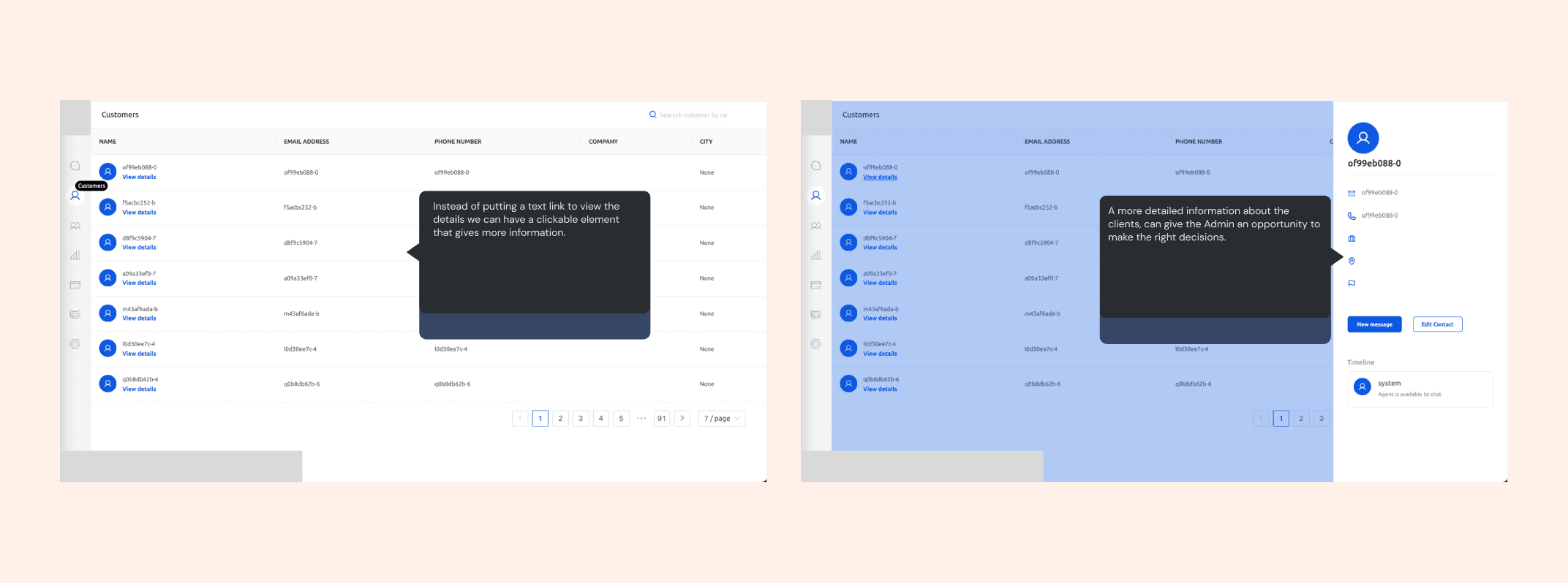
From the UX Audit
To gain comprehensive insights into the problem, I conducted a thorough UX audit of the current platform, pinpointing specific areas requiring attention.
DESIGN SOLUTIONS
Optimizing the signup and onboarding process
Initially, the absence of a defined signup process presented a challenge. To address this, I developed an intuitive signup flow, streamlining the user journey. Additionally, I introduced a "Get Started" onboarding screen to swiftly acquaint new users with the app's functionality. Recognizing the importance of efficiency, we optimized the process for adding team members, ensuring a seamless experience.
Improving client solution process
I streamline the current lengthy process of addressing client concerns by implementing real-time communication channels for seamless interaction and facilitating quick client assignments to designated team members, ensuring efficient follow-up.
An intuitive way to manage chats
I identified a challenge in the current app regarding chat management, including open, closed, and snoozed chats, without disrupting user flow. To address this, I developed a solution focused on intuitive chat filtering, seamless client follow-ups, and effortless chat status updates.
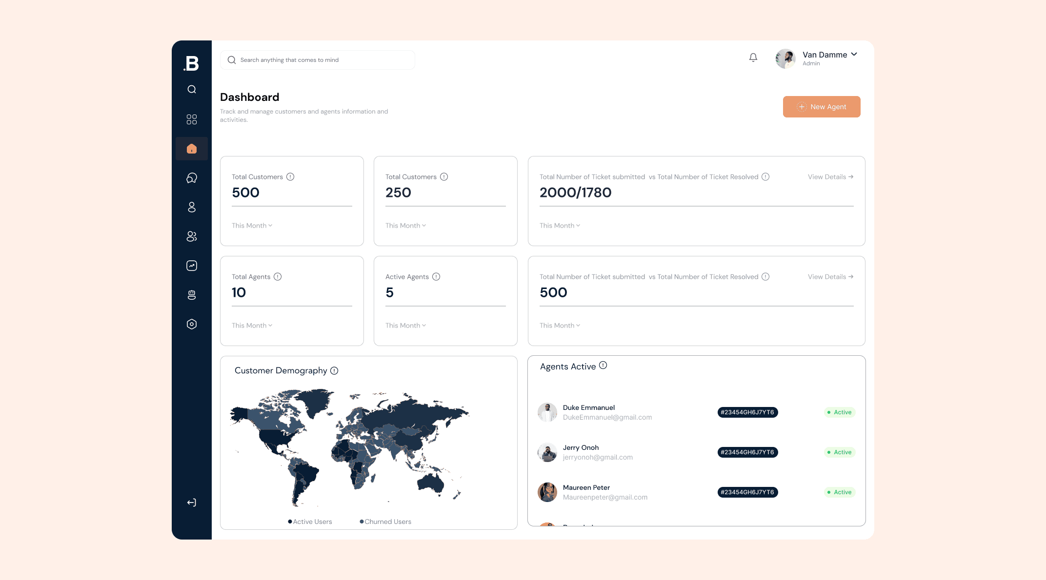
The need for a dashboard interface
The absence of a dashboard on the existing platform hindered efficient data management and insight consolidation from all activities. This gap in functionality significantly diminished administrative control and hindered the decision-making process.
MOVING ON
Time to iterate
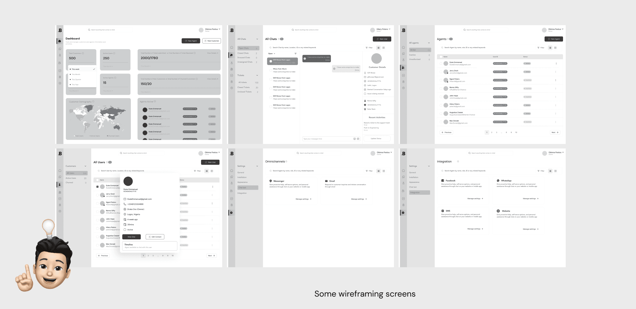
After reviewing the existing platform. I was able to iterate my ideas into simple black-and-white wireframes. At this point I had some great ideas on how to improve the experience on the platform.